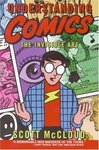
© Amazon.fr
A meta comic-book by Scott McCloud made in 1992 to explain the concepts behind
comic books, drawn as a comic book. Below are a few things I found
interesting.
The simplification of the appearance of the characters allows the reader to
identify to them; simplified drawings represent the concept of what is drawn,
rather than the object/person that is drawn. Hergé uses realistic backgrounds
with cartoonesque (simplified) characters.
The reader perceives the passing of time between panels, this is called
closure. Six types of closures:
- Moment-to-moment: like between pictures in a movie
- Action-to-action: single subject showing the progression of an action
- Subject-to-subject: between subjects within the same scene or idea
- Scene-to-scene: between scenes, possibly long distance or time betwenn the scenes
- Aspect-to-aspect: not a represting the passing of time, but shows different aspects of a place, mood or idea
- Non sequitur: no relation whatsoever between the panels
Most Western comics use a majority of type 2, with a few 3 and 4. Manga uses
additionally a few type 1 and 5.
Lines expressing rapid movement have taken time to develop, where messy in the
early comics. American comics mostly represent moving objects as blurry, with
a sharp, fixed background, while mangas represent rather sharp moving objects
with a blurry background.
A lot of conventions and symbolism in drawing (hearts for love, lighting for
pain, birds/stars for stunned); some symbols have context-dependent meaning
(wavy lines can represent smoke, heat or bad smell).
Many combinations of words with picture.
- picture is a simple illustration for the words
- words are like a soundtrack to the picture
- picture and words are redundant and give the same message
- one amplifies the message of the other
- pictures and text tell parallel stories
- words are integrated into the picture as a montage
- words and pictures are complentary, both are needed to convey the message
When color printing became affordable, American comics used cheap printing techniques,
limiting the choice to uniformely filling areas with one three primary colors
in three degrees of intensity (plus black for the lines). Better quality color
printing was available in Europe, but e.g., Hergé chose to use flat colors.